
Overview
In 2020 we have an initiative to improve our Midtrans payment gateway onboarding registration. The aim of this initiative was to increase the activation rate and to enable a registration for a social seller or we called it individual merchant.
Lead Product Designer
Product Manager, Fullstack engineers, Product Researcher, Business stakeholder, UX Writer & Product designer
August - September 2020
The Opportunity
During the pandemic a lot of people are starting their business through social media where they accept payment from the buyer by direct transfers. While Midtrans payment gateway are heavily trusted and used by enterprises clients.
New micro, small and
medium merchants in 2019
Selly’s users are trying to
register to Midtrans
What do we want to achieve?
We want to make sure that onboarding can be done by socials seller or individual merchants independently and seamless interaction from start to finish
Onboard 10K merchant
Targeting to onboard up to
10k merchants on H2 2020
Activation rate > 50%
Increase Activation Rate for
Passport Merchant to >50%
The Metrics
We define success metrics for this project to be used on monitoring the project post lunch.
* We called the onboarding flow as passport, Selly is a keyboard app specially made for Online Sellers
↑ merchant onboarded with selly origin
↑ merchant onboarded from whatsapp
↑ merchant onboarded from passport midtrans
↓ complaint/drop because bank validation issue
Research
What are the users perception to current flow?
We started with doing the deep analysis for the current passport onboarding flow and do research evaluation on the current flow. We successfully interview 8 merchants (4 Corporate, 4 Individual)


However, some merchants experience has several issues and pain points on Passport and expect Midtrans to make corresponding improvements.

Merchants have certain Onboarding Journey-specific pain points
Once we done with the interview, we also start with doing a gap analysis & also do the deep analysis to each page on the onboarding journey.
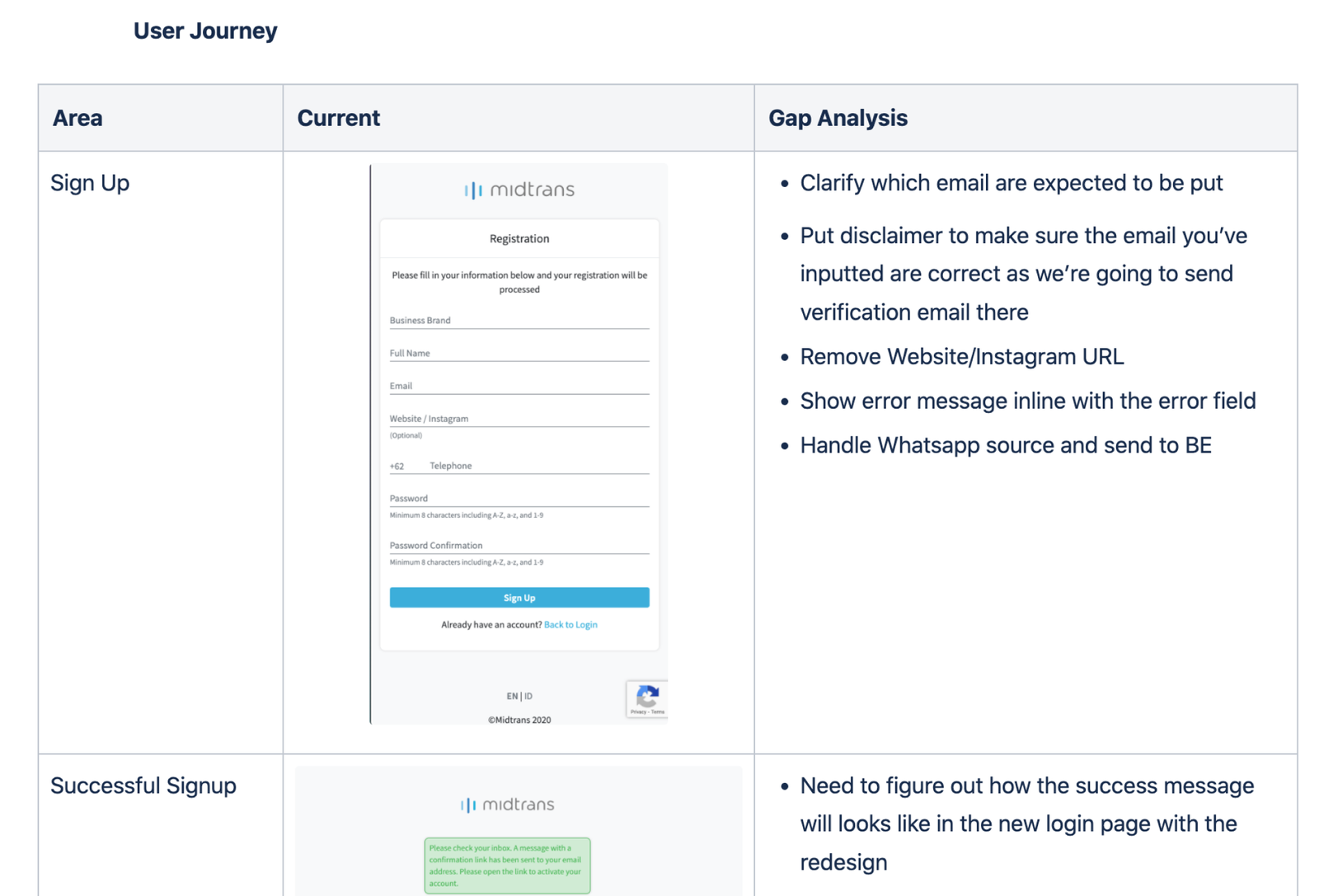
*Due to the legal and privacy of the company, I can only show part of the gap analysis documents that we made.

Studies Insight
After conducting user interviews, gap analysis and analysing the gathered data. We was able to listed out the pain point from users
Unclear/Lack of information
Text-heavy information makes merchants reluctant to read & end up missing important information
- Some fields are unclear and misleading (e.g. whose email for “Email” field)
- Unnecessary fields in the sign up form (e.g. Social Media)
Slow merchant support
Emailing customer support or contacting the Sales team is painful for them because they mostly receive slow responses.
Preparation/Technical issues
Website readiness criteria is not well communicated to merchants Merchants need guideline to complete website readiness.
Limited payment activation choice
Passport only enables activation for certain payment methods. Merchants need to make further contacts or do more manual work of signing addendums to activate more payment methods
Incorrect onboarding submission data
Merchants submitted wrong information or missed several required documents, therefore giving difficulty for the internal ops team to verify their data and complete the onboarding process
Recommendation
With a lot of discussion with product manager, engineer team, researcher, customer support team & also business stakeholder, we were able to come up with several recommendations.
Revamp the design to make the information more discoverable & ensure it is as transparent as possible.
— Revamp the design to be less text-heavy & emphasize important information
— Provide a clearer naming for each field
— Take out redundant and unnecessary fields from the sign up form
Update information on solving new surfacing issues on the FAQ page
Provide clear guideline on website readiness & example for merchants to learn from.
We should reconfigure the Bank Validation process, while ensuring the process is secure for merchants and efficient on our side.
Conceptualisation
Since the team decided to work on the recommendations. Now we start working with making a wireframe to cover all the primary use cases.

Hi-fidelity Mockups
After all the use cases on wireframe were agreed by Product Manager, Engineer, and Stakeholders. We go-ahead to create Hi-fidelity mockups and create prototype as we began to conduct usability test for 2 times with different segmentation of users.
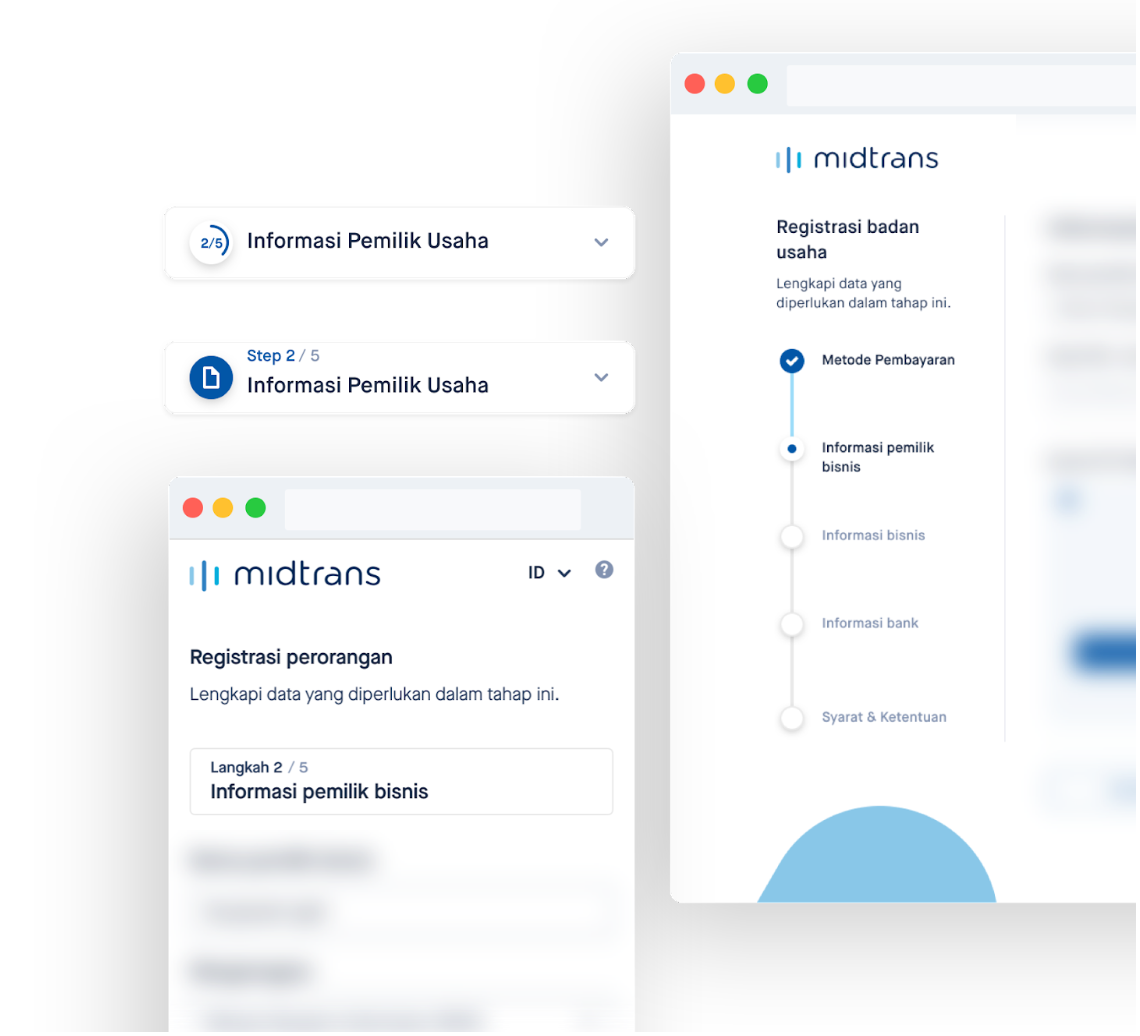
Enables untrained users to achieve a goal through a series of steps
We explored and tested severals option to make sure that merchants are understand the meaning of the steps, and could know where they are on the step and how many steps that they need to go through.
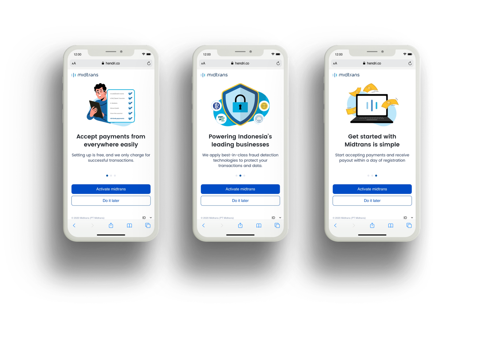
Onboarding
Activation onboarding flow. When merchant are log in to Midtrans dashboard, we will show a splash screen or onboarding screen to invite them to do the activation for the payment gateway.
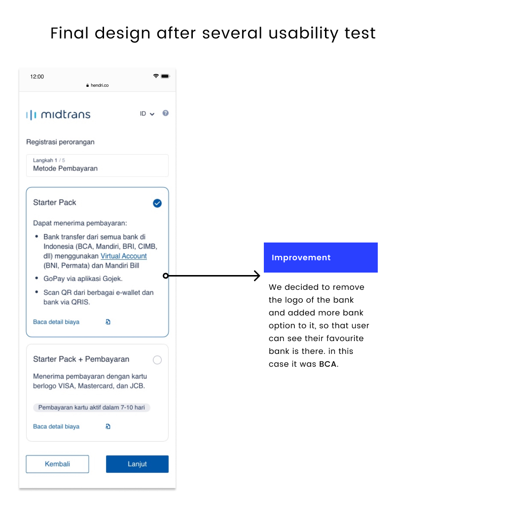
Step 1 – Payment Package
When merchant start to do the payment activation journey. They will be given option to choose either they want to register the payment option as individual seller or as company.

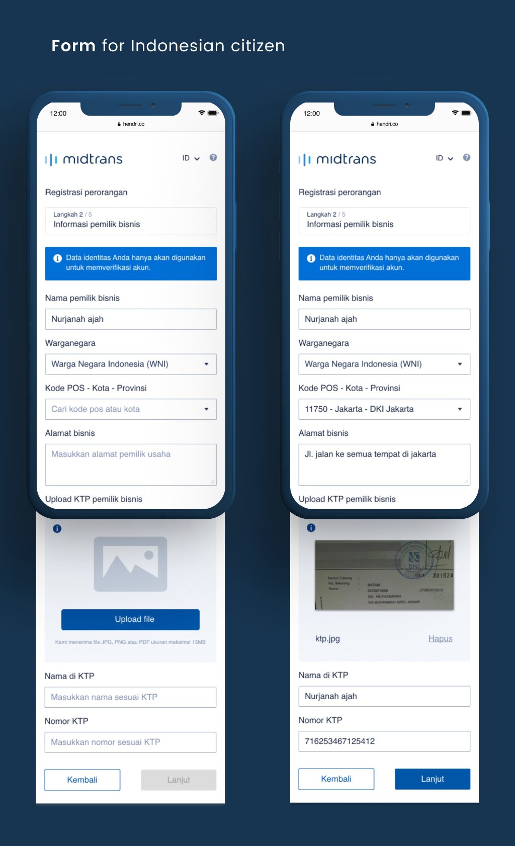

Step 2 – Owner Information
As a rule from Indonesian government that every individual business that want to activate a payment gateway they need to submit several information and documents.
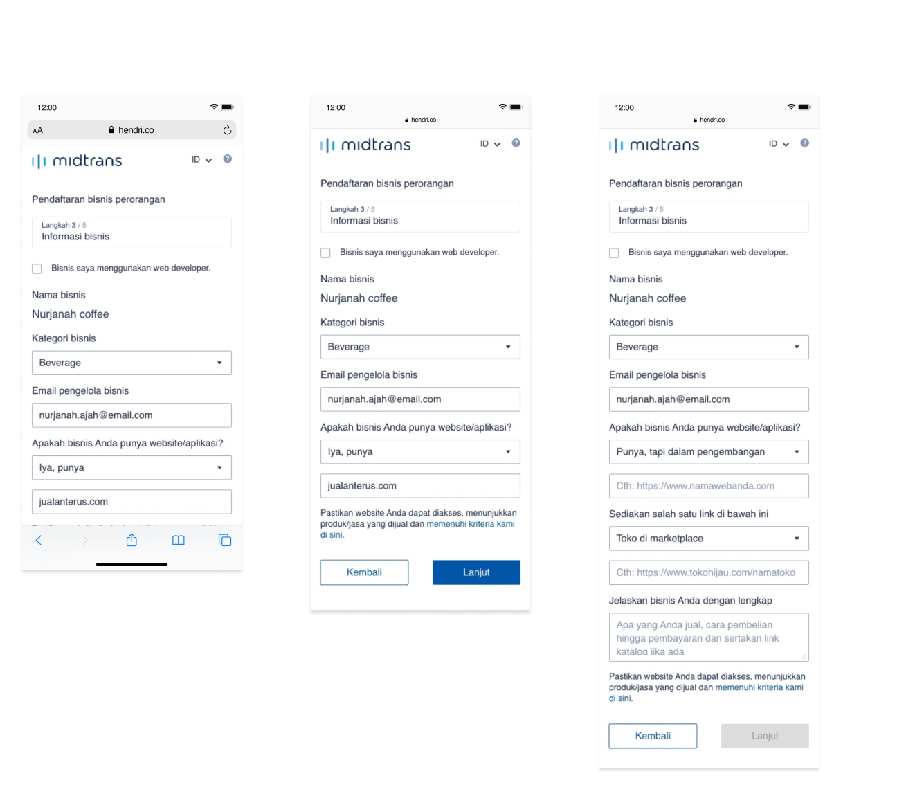
Step 3 – Business Information
Merchant also are expected to provide more details on their business, also they need to provide either a website url or marketplace url or social media url.


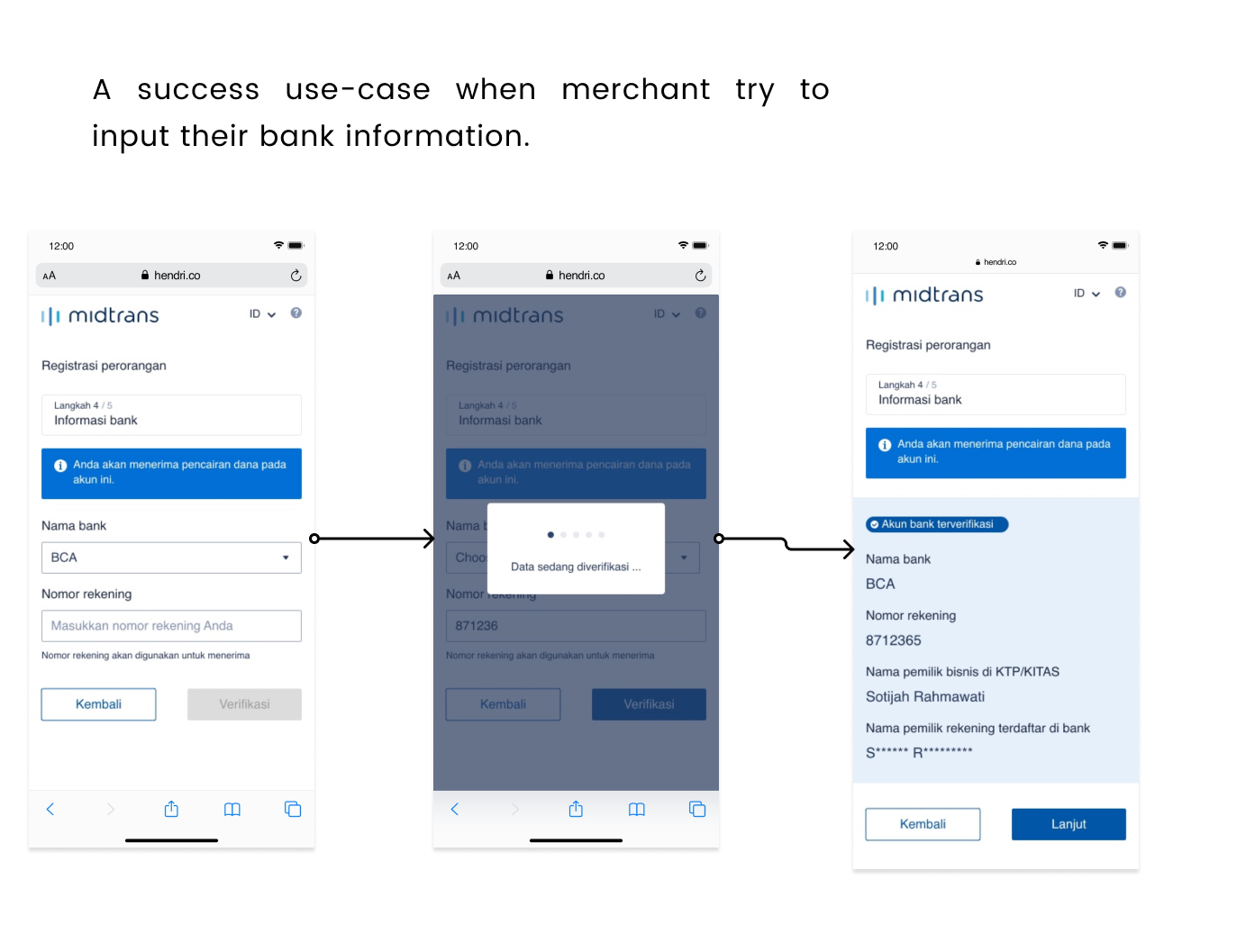

Step 4 – Bank Information
Merchant are also asked to provide bank information to receive the money from their transaction through Midtrans.
The name on bank information should be the same as name on the Midtrans account to prevent scamming or money laundry, however they can provide a copy of account book or a copy bank statement to continue the step.
Step 5 – Term & Condition and Finish Onboarding
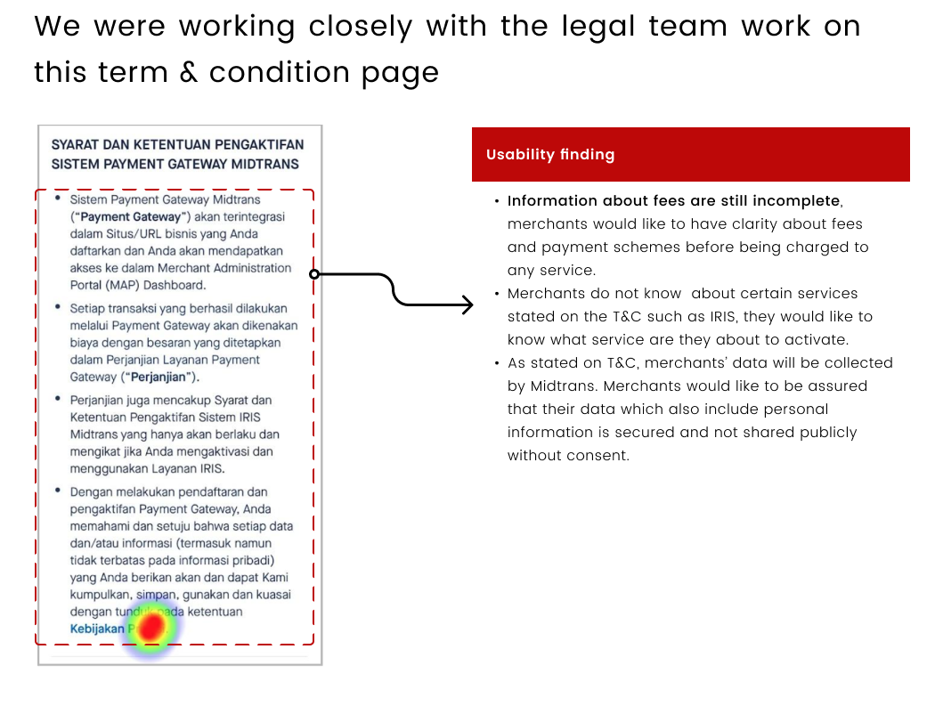
The last step that merchant need to complete is to accept term & condition before they can finish the payment activation process.


Desktop Version
Once we finish with all the mobile version, we also working on the desktop version to support a merchant who access the page from their computer.
The Result
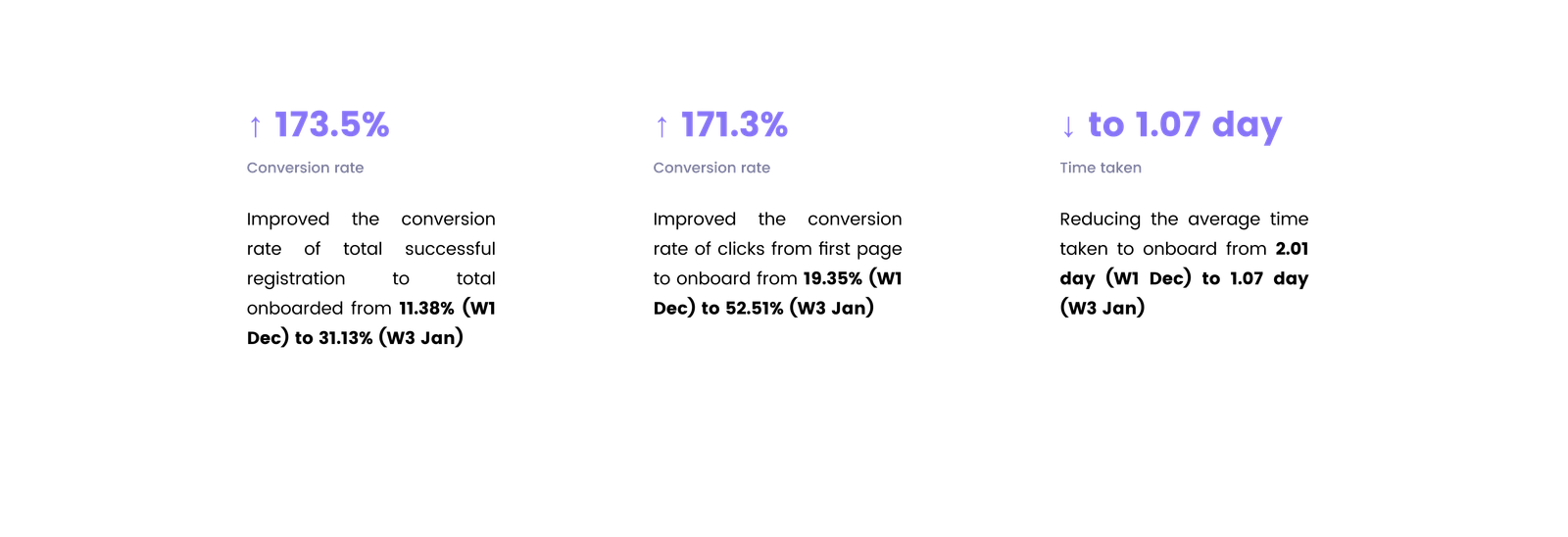
This initiative was launched in January 2021 in Indonesia. And during the first month we got some interesting numbers.
What we learn
During the project run from the start to finish, we learn some interesting point
Give proper context and clarity
In this onboarding case that required merchant to fill in a lot of information and make them going through a lot of steps, it’s important to give them a proper context on what they need to provide and why we need those information.
Don’t give users obstacles
From the old version of the onboarding we learn that there is too much mandatory information or documents that even some of individual merchant doesn’t need to provide and it obviously blocking them to complete the activation process.


